Case study · Kodiak Financial

An accountant's website that feels as trustworthy as they are.

Kodiak Financial looks after the accounts of small businesses and sole traders across Leeds and Yorkshire. We rebuilt their website with an updated design, and we manage their business email too.

Client
Kodiak Financial
Sector
Accountancy, Leeds and Yorkshire
Services
Website rebuild and redesign, email management
Year
Rebuilt 2024

The brief

Make the numbers feel less daunting.

Kodiak Financial is an AAT-licensed accountant and QuickBooks ProAdvisor based in Leeds. It handles year-end accounts, bookkeeping, VAT, payroll and startup advice for limited companies and sole traders.

Choosing an accountant is a trust decision, and many small business owners find the whole subject stressful. So the rebuilt site had to feel calm, modern and approachable, explain each service in plain English, and make it easy to start a conversation.

What we did

  • Rebuilt the website with an updated design
  • Service pages with clear offers and prices
  • Calls to action for the quiz, a free quote and WhatsApp
  • Business email set up and managed
UX decisions

Every decision, and why we made it.

Every part of the site is there to build trust or to give a nervous visitor an easy next step.

  1. Two ways in, for two kinds of visitor

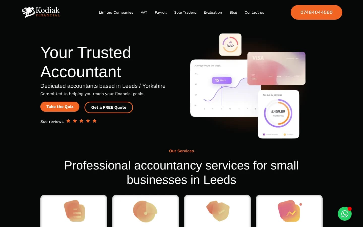
    The hero offers Take the Quiz beside Get a FREE Quote, with the phone number in the header and five stars linking to reviews.

    Why it worksSome people are ready to talk, while others just want to know where they stand. A quick quiz gives the unsure visitor a low-pressure first step, so they don't simply leave.

    The Kodiak Financial homepage: Your Trusted Accountant, with Take the Quiz, Get a FREE Quote and floating finance dashboard cards
  2. Finance that looks friendly

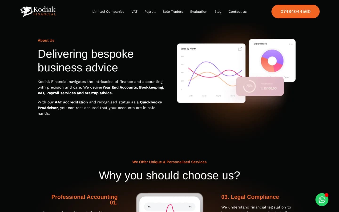
    Soft, glowing dashboard cards (charts, balances, a savings ring) float on a deep black background, lit with Kodiak's orange.

    Why it worksAccounting can feel dry and intimidating. Clean, modern visuals hint at clarity and control, so the subject feels approachable before anyone reads a word.

    Delivering bespoke business advice, beside soft chart and spending cards
  3. Four services, one clear choice

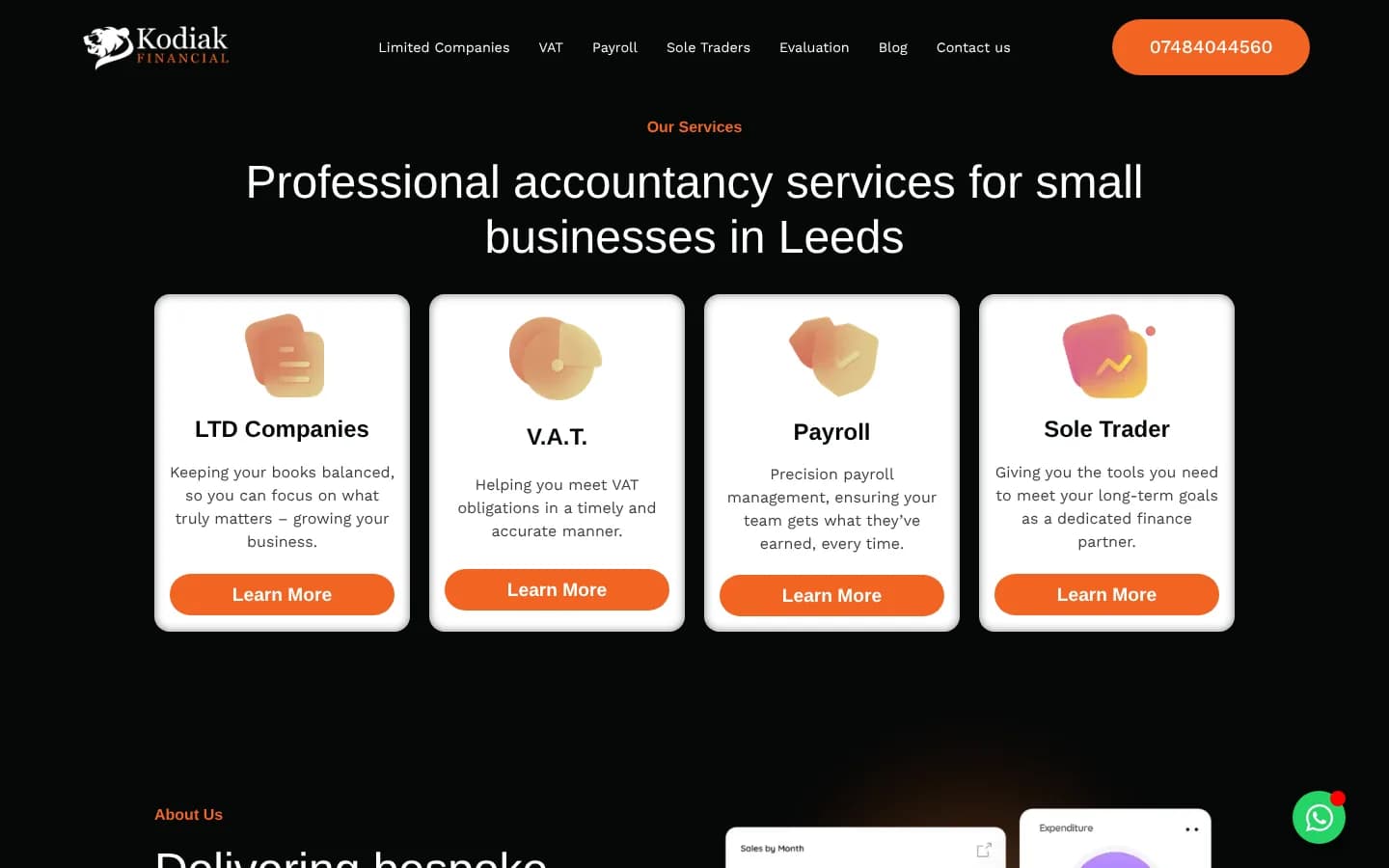
    Limited companies, VAT, payroll and sole traders each get a card with a single plain-English line and a Learn More button.

    Why it worksMost visitors know which of these they are. Letting them self-select in one glance takes them straight to the page that speaks to them.

    Professional accountancy services for small businesses in Leeds: four cards for LTD Companies, VAT, Payroll and Sole Trader
  4. The offer, upfront

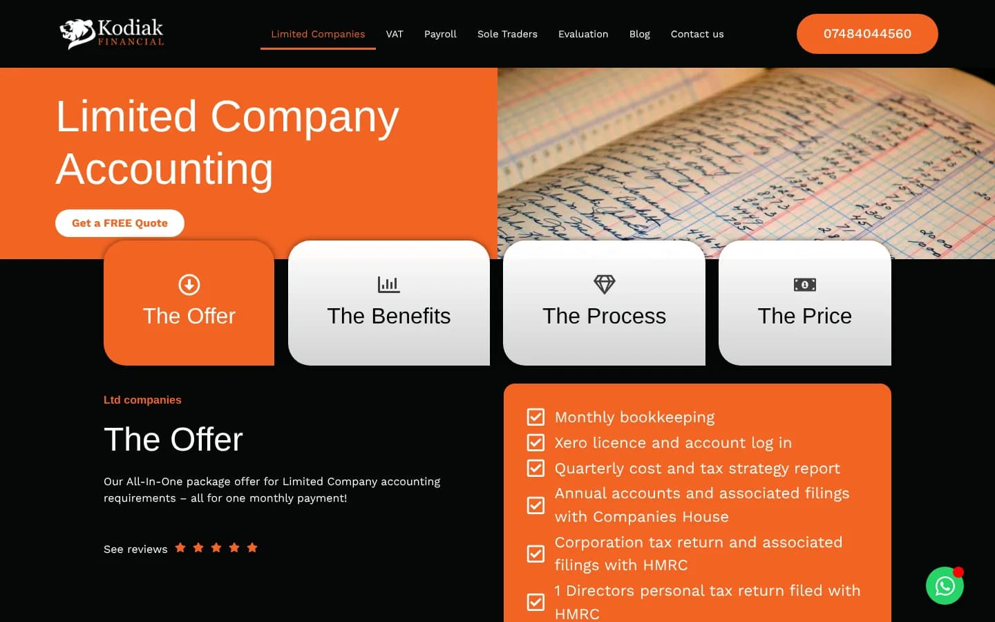
    Each service page leads with what's included (monthly bookkeeping, filings with Companies House and HMRC) under tabs for The Offer, The Benefits, The Process and The Price.

    Why it worksPeople worry about hidden costs and surprises with an accountant. Laying out exactly what they get, and what it costs, answers those questions before they need to ask.

    The Limited Company Accounting page with tabs for The Offer, The Benefits, The Process and The Price, and a checklist of what's included
  5. The same pattern on every service

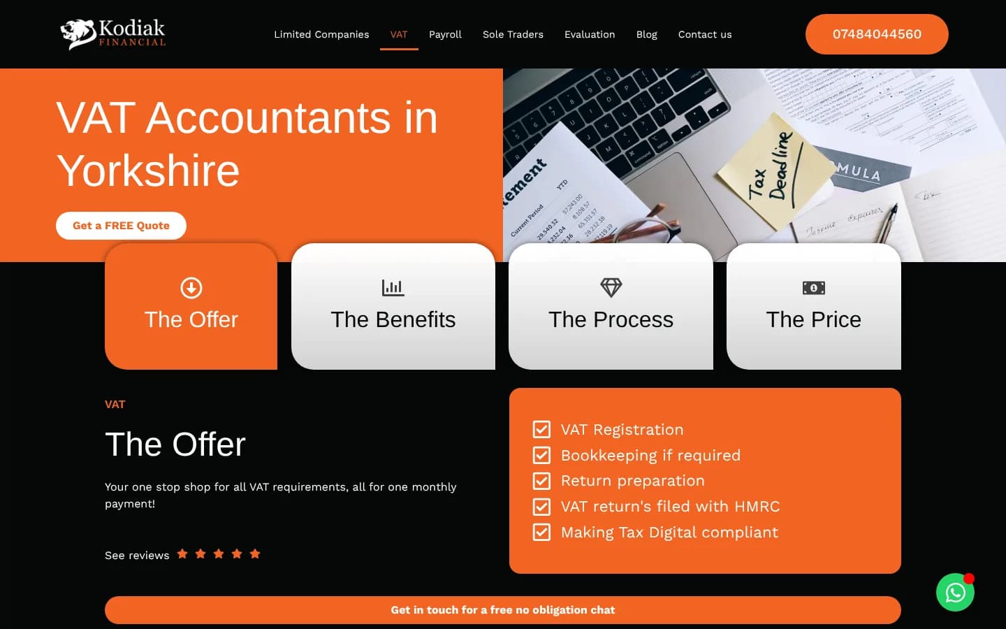
    VAT, payroll and sole trader pages follow the same layout, with Get a FREE Quote at the top and a free, no-obligation chat at the bottom.

    Why it worksOnce someone has read one service page, they know how to read them all. Consistency makes the site feel dependable, which is exactly what you want from an accountant.

    The VAT Accountants in Yorkshire page with the same tabs and a checklist of the VAT offer
  6. Credentials that reassure

    AAT accreditation and QuickBooks ProAdvisor status appear in the copy and as badges in the footer of every page.

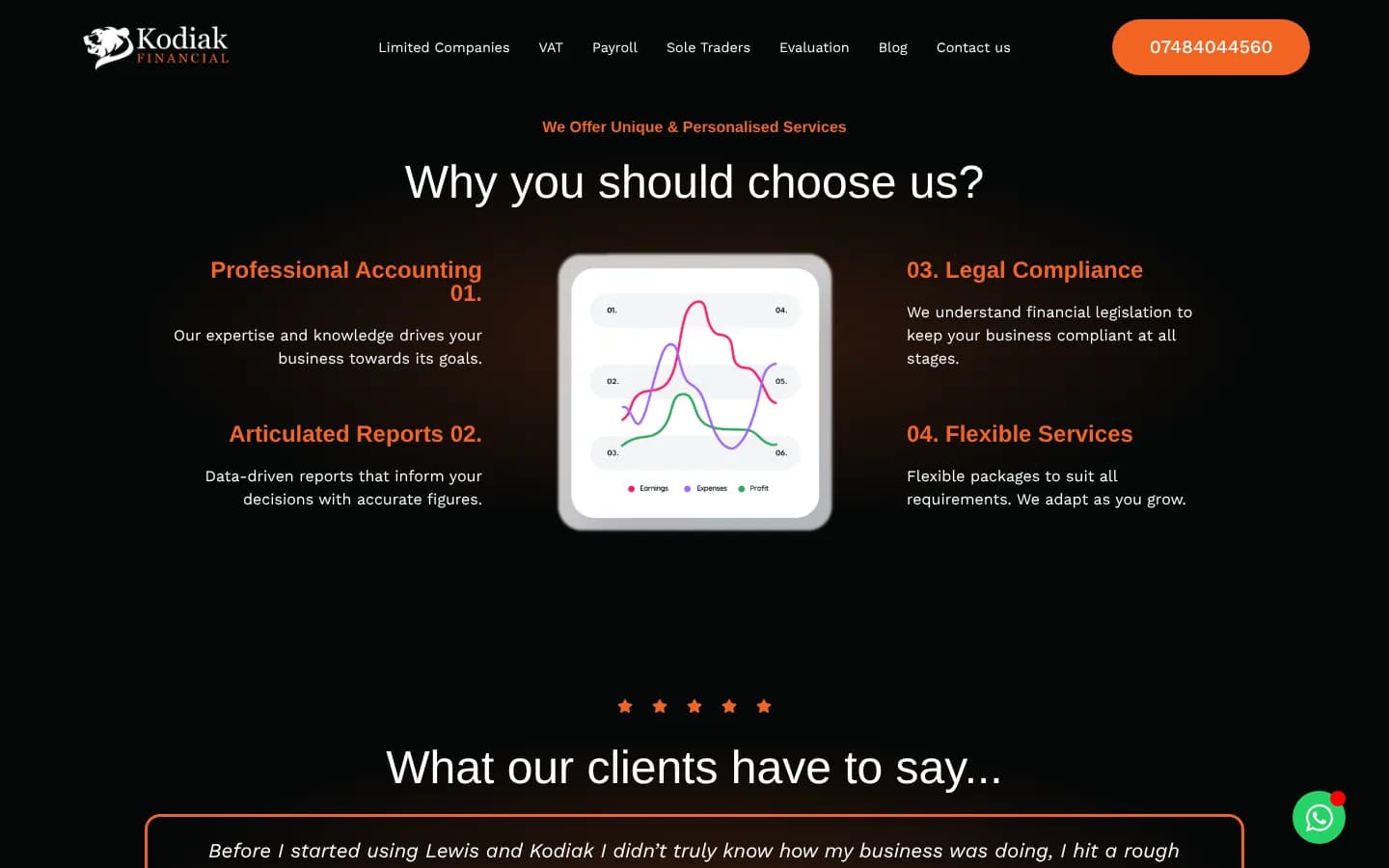
    Why it worksVisitors can't judge an accountant's skill directly. Recognised accreditations are quick, credible proof that their accounts will be in safe hands.

    Why you should choose us: four reasons around a chart, from professional accounting to flexible services
  7. Real clients, in their own words

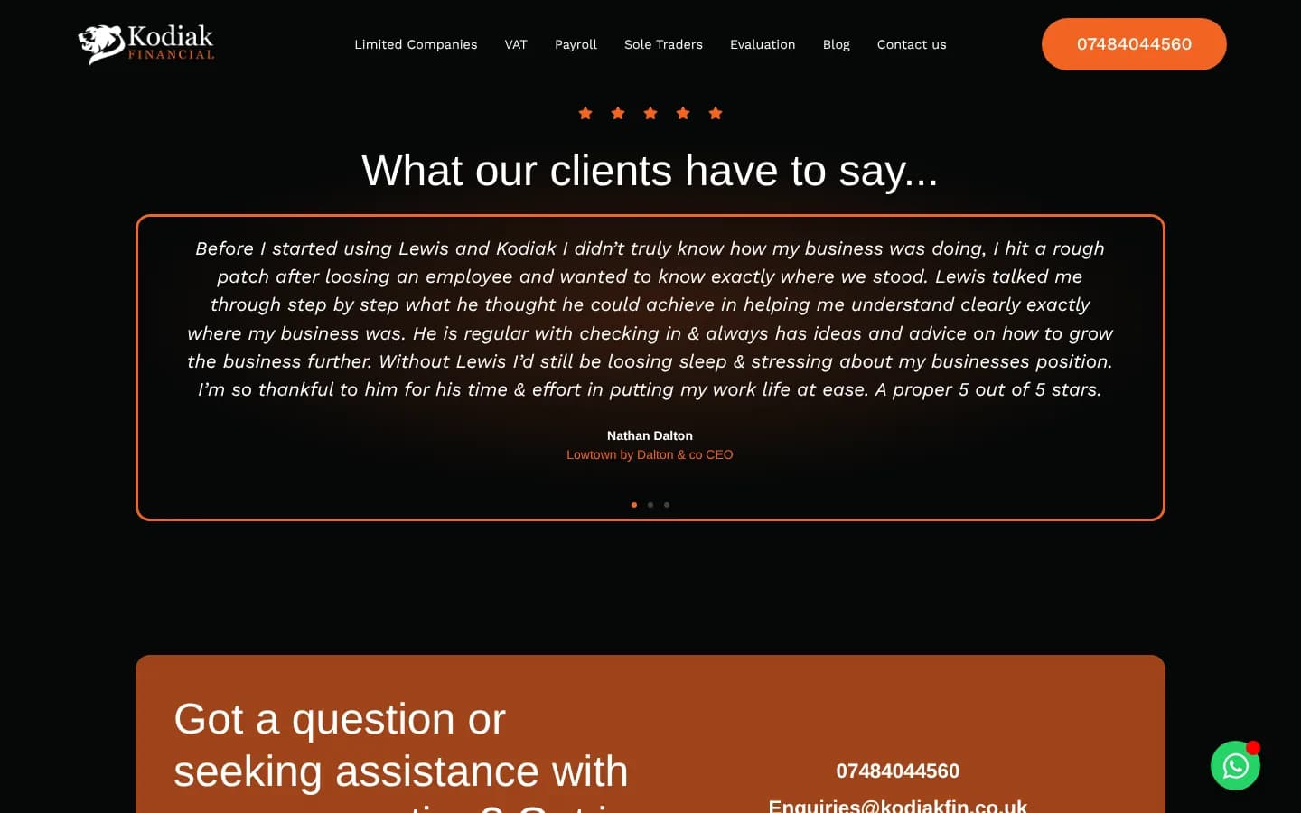
    A testimonial carousel shares detailed reviews from local business owners, each with their name and business.

    Why it worksA named review from a nearby business is far more convincing than any claim the accountant makes about itself.

    What our clients have to say: a review from Nathan Dalton of Lowtown by Dalton & Co
  8. Help is never more than a tap away

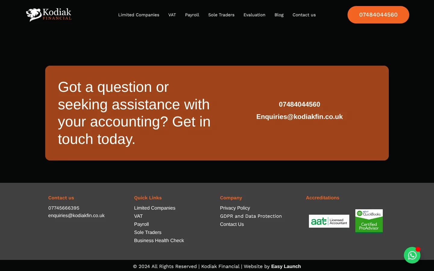
    A bold orange panel offers the phone number and email on every page, with a WhatsApp button floating in the corner.

    Why it worksSome people would rather message than fill in a form. Offering every route, everywhere, means nobody who wants help has to go looking for it.

    The orange Get in touch today panel above the footer, with accreditation badges
  9. Built for the phone

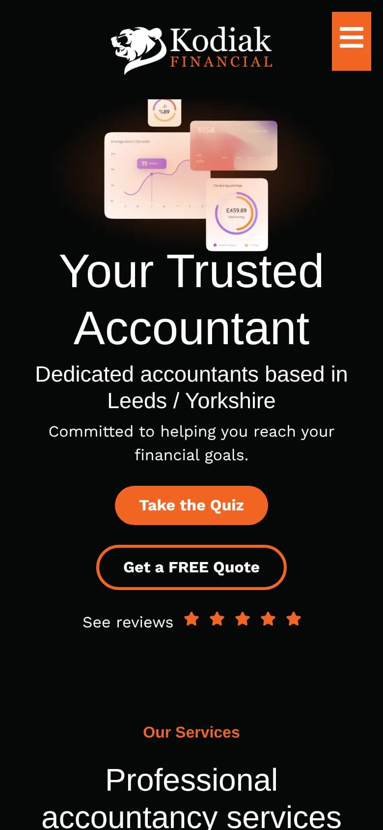
    On mobile, the visuals sit above the headline, and the quiz and quote buttons stack into full-width, easy-to-tap shapes.

    Why it worksPlenty of business owners check their accountant on the go. Big targets and a short route to the first action make the site just as easy to use on a phone.

    The Kodiak Financial homepage on a phone, with Take the Quiz and Get a FREE Quote stacked

Email management

Business email, handled.

Alongside the website, we look after Kodiak's business email, so the team can focus on their clients' numbers.

  1. Set up properly

    Professional addresses on Kodiak's own domain, configured so emails are delivered and trusted.

  2. Looked after day to day

    New mailboxes, changes and support handled whenever they're needed.

  3. One point of contact

    The same team that runs the website looks after the email, so there's always one place to ask.

Your project could be next.

Reality has limits. We don't.

Tell us what you’re planning and we’ll show you how we’d approach it.