Case study · Nora Wellbeing

A wellbeing brand you can feel before you read a word.

Nora came to us with a logo they never loved. We built everything else from a blank page: the mark, the colours, the candle labels and an online store that sells from the first screen.

Client
Nora Wellbeing
Sector
Aromatherapy
Services
Brand identity, guidelines, packaging, online store
Year
2026

The brief

One logo, and a blank page.

Danny came to us with a logo they had never really loved and nothing else around it: no colours, no type, no packaging, no website.

The ask was simple and ambitious at once. Start again from scratch and build a complete brand that feels as calm and premium as the products inside the jar.

What we delivered

  • Brand identity
  • Brand guidelines
  • Packaging for three launch scents
  • A fully custom online store
Before and after

From a seal to a ritual.

Drag to compare the original label with the new one.

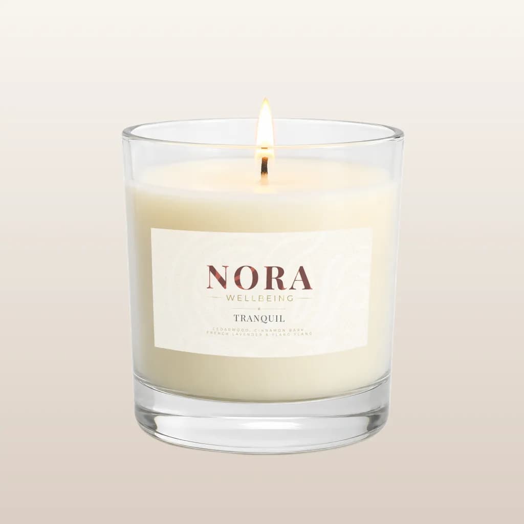
The new Nora Tranquil candle: a cream label with the fine-line NORA Wellbeing logo
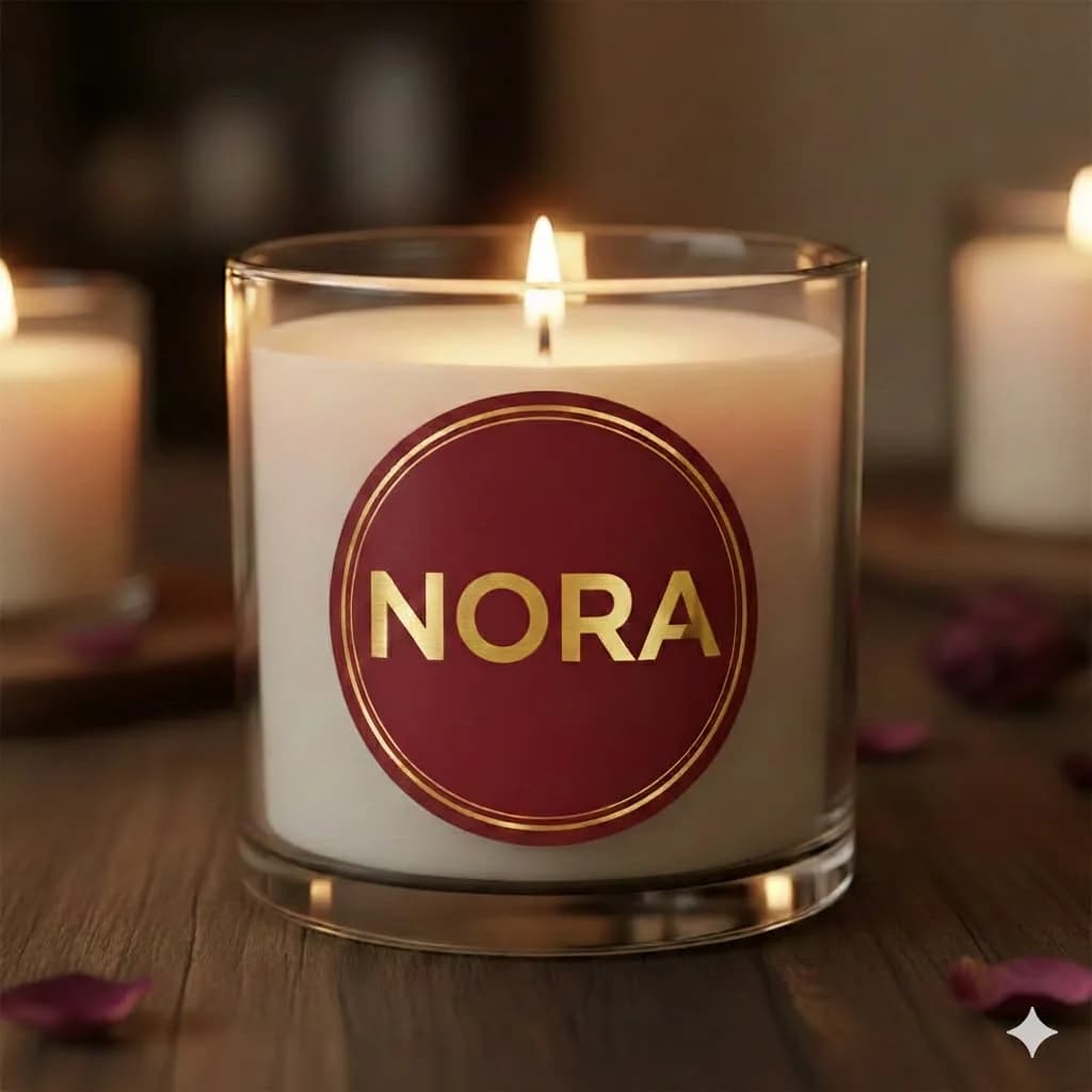
The original Nora candle: a heavy gold sans-serif NORA inside a burgundy circle
  1. The old mark said the name, and nothing else

    A heavy sans-serif inside a filled circle reads more like a seal or a price sticker than a wellbeing brand. It told no story about scent, nature or calm.

  2. There was no system around it

    No colours, type or rules meant nothing to carry onto labels, a website or social.

  3. The new label invites you in

    A light, airy label with room to breathe moves Nora from a candle company to a ritual brand, which is what lets it sit at a premium price.

The mark

What does aromatherapy look like?

The moment a scent leaves the candle and drifts into the room. That's the idea the whole mark is built on.

64px
40px
24px
16px
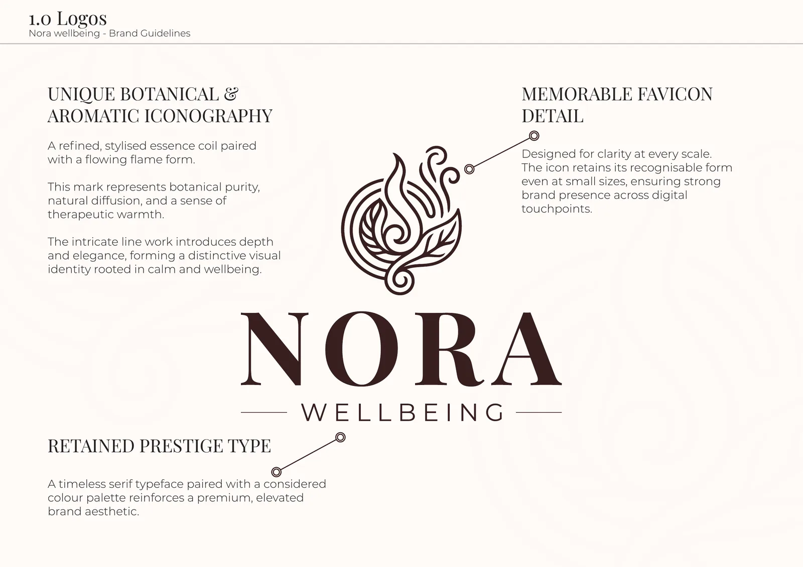
  1. An essence coil meets a flame

    A stylised botanical coil and a rising flame: a candle, a plant and a wisp of scent at once. It tells the product story without needing words.

  2. Line work, not solid shapes

    Fine, flowing strokes feel hand-crafted and gentle, with depth up close and a sense of movement, like vapour rising.

  3. A serif with presence

    NORA is set in a high-contrast serif with generous spacing, the language of premium fragrance houses. WELLBEING sits beneath in a light, spaced sans between fine rules.

  4. Built to scale

    The icon stands on its own at favicon and social sizes, so the brand stays recognisable from a browser tab to a candle label.

Colour

A colour for every mood.

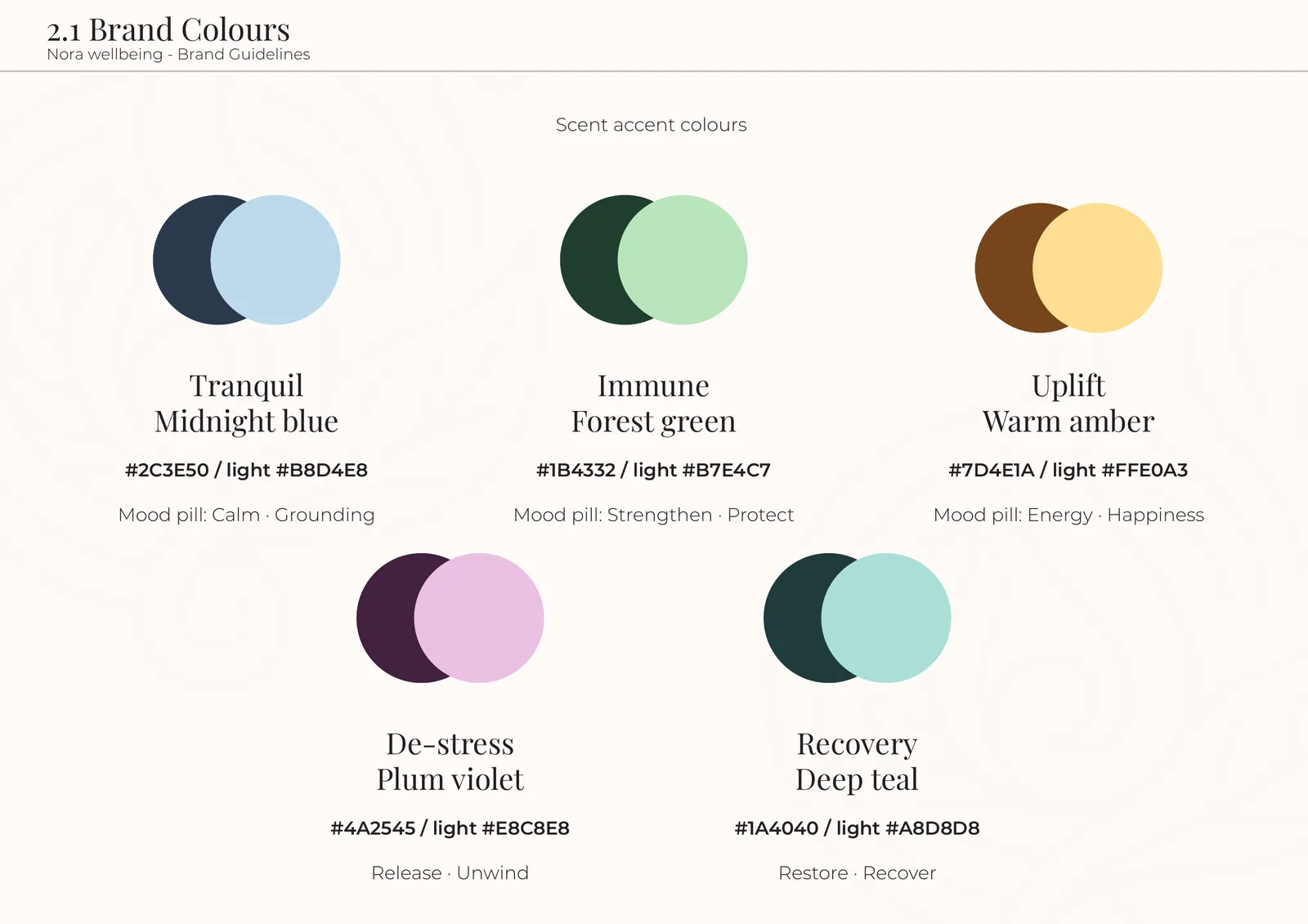
Every Nora candle shares the same glass, label and silhouette. That's what makes a range feel premium, but it makes Tranquil hard to tell from Uplift. So every scent got its own mood colour, with a deep tone and a light tint.

Core palette

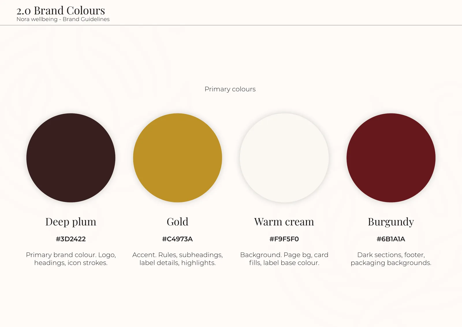
  • Deep plum#3D2422Logo and headings
  • Gold#C4973AFine detail that signals quality
  • Warm cream#F9F5F0Room to breathe
  • Burgundy#6B1A1AFooter and packaging

Mood colours

  • Tranquil#2C3E50 / #B8D4E8Calm, grounding
  • Immune#1B4332 / #B7E4C7Strengthen, protect
  • Uplift#7D4E1A / #FFE0A3Energy, happiness
  • De-stress#4A2545 / #E8C8E8Release, unwind
  • Recovery#1A4040 / #A8D8D8Restore, recover

Brand guidelines

A system that grows with them.

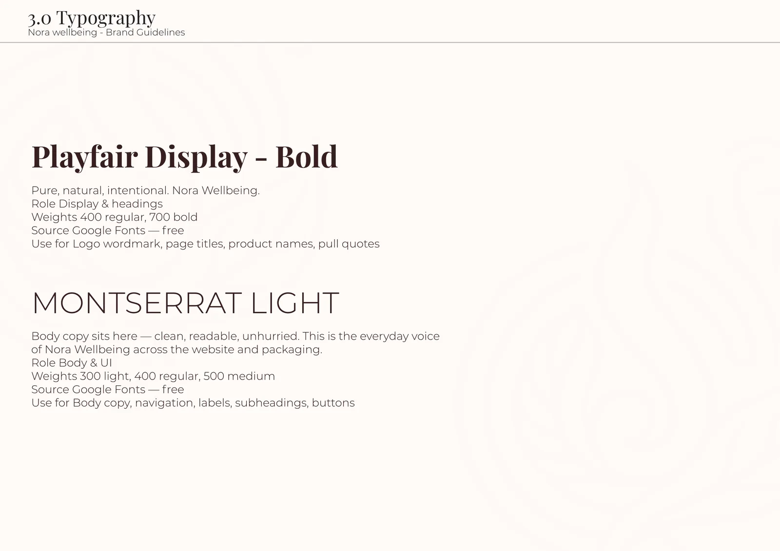
Playfair Display for headings brings elegance and heritage; Montserrat Light keeps body copy clean and unhurried. Both are free Google Fonts, so the brand stays consistent across web, print and packaging with no licence costs.

Brand guidelines page 1.0: the Nora logo with notes on its botanical icon, favicon detail and prestige type
1.0 The logo
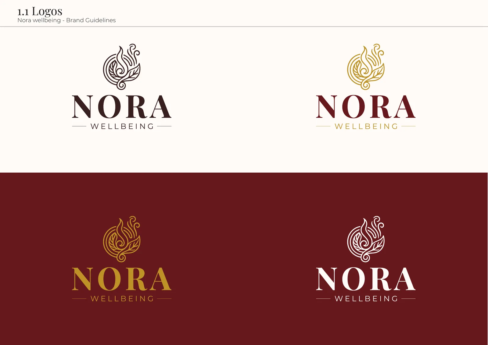
Brand guidelines page 1.1: the logo in plum, gold, cream and mixed versions on cream and burgundy
1.1 Logo colourways
Brand guidelines page 2.0: deep plum, gold, warm cream and burgundy swatches
2.0 Brand colours
Brand guidelines page 2.1: the five scent accent colours, each a deep tone with a light tint
2.1 Scent colours
Brand guidelines page 3.0: Playfair Display Bold and Montserrat Light
3.0 Typography

Try it

What do you need today?

The store's homepage asks a question instead of showing a grid. Pick a mood and the whole scene changes with it, just as it does on the live site.

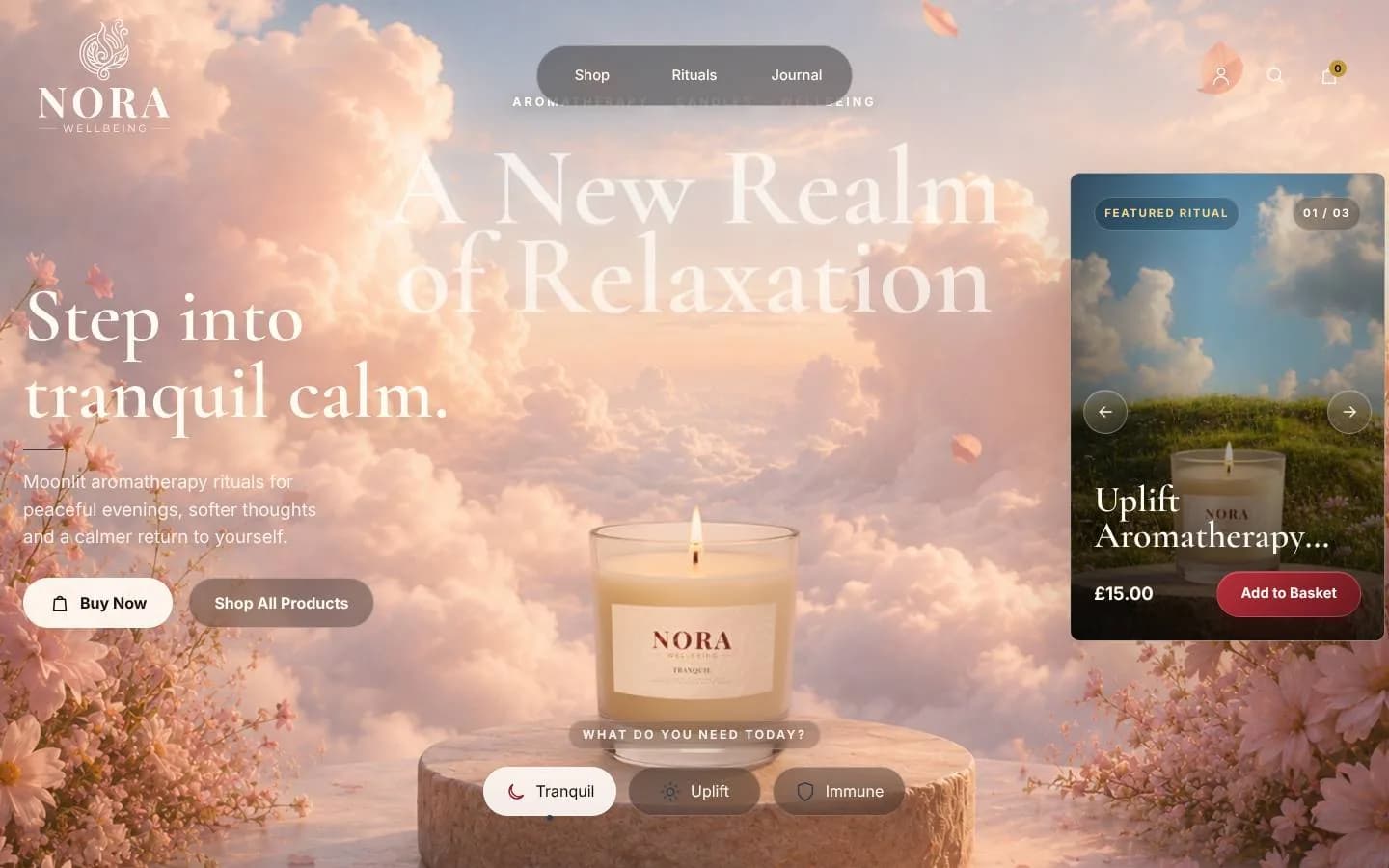
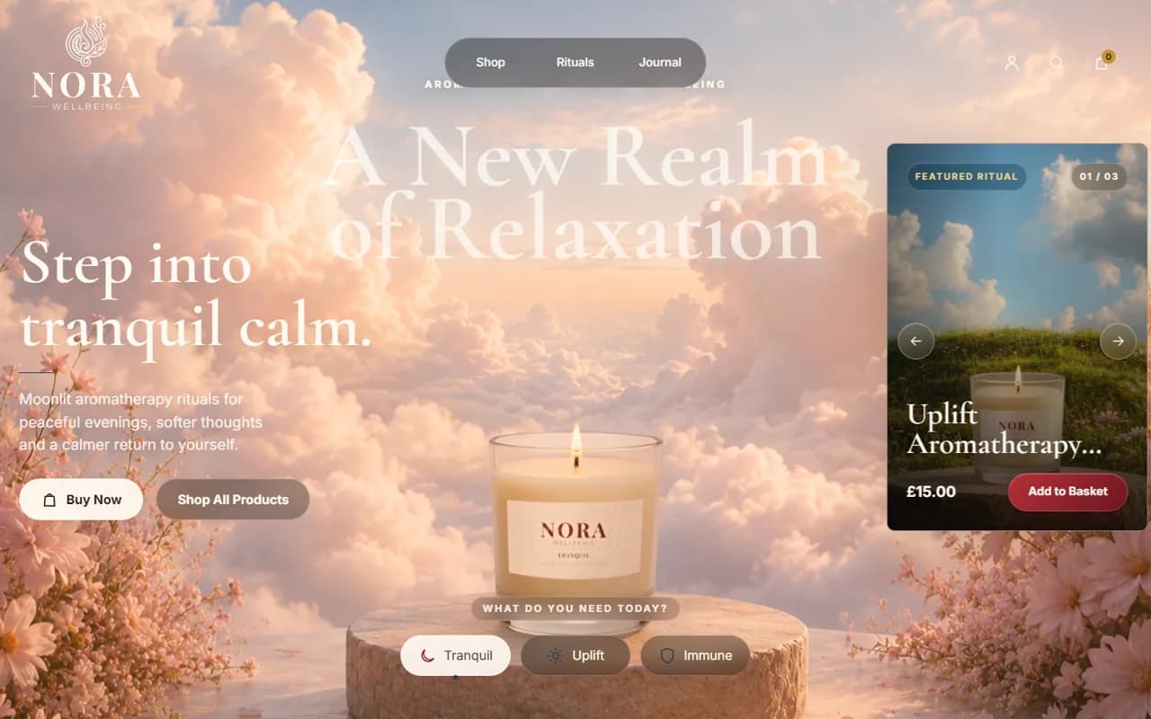
The Nora homepage on Tranquil: a candle on a stump among pink clouds and blossom, headed Step into tranquil calm
Soft pink cloudsTranquil drifts into a sky of soft clouds and blossom, so you feel calm before you read a word.
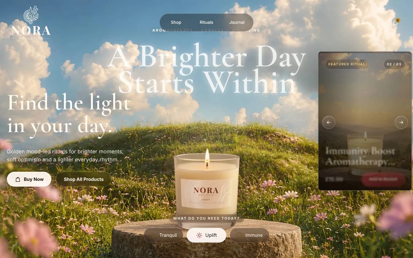
The Nora homepage on Uplift: a candle in a sunlit wildflower meadow, headed Find the light in your day
A sunlit meadowUplift opens onto a bright meadow of wildflowers, with copy about finding the light in your day.
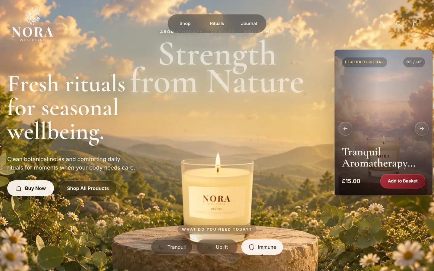
The Nora homepage on Immune: a candle above a golden valley, headed Fresh rituals for seasonal wellbeing
A golden valleyImmune looks out over a golden valley, for fresh rituals and seasonal wellbeing.

The online store

Every decision, and why we made it.

The store's main job is to sell candles, with room to grow into a wider wellbeing range. Every decision serves one of two goals: let people buy the moment they land, and let them feel the brand while they do it.

  1. Shop from the very first screen

    The hero carries Buy Now and Shop All Products above the fold, plus a featured product card with its price and Add to Basket.

    Why it worksEvery extra step between wanting something and the basket loses people, so the shortest path sits right where the eye lands.

    The Nora hero with Buy Now, Shop All Products and a featured product card with Add to Basket
  2. A question, not a product grid

    “What do you need today?” is answered with three mood buttons: Tranquil, Uplift and Immune.

    Why it worksPeople rarely shop for a scent by its ingredients. They shop for how they want to feel, so framing the choice around a need turns browsing into a quick, personal decision.

    The Nora hero with the What do you need today? buttons for Tranquil, Uplift and Immune
  3. Each mood transforms the page

    The scene, headline, copy and featured product all change with the mood you pick.

    Why it worksThe backgrounds show what each candle is meant to do without saying it, which builds desire and helps people pick the right product for themselves.

    The Nora hero switched to Uplift, with a sunlit meadow scene
  4. Scenes that feel alive

    The hero backgrounds are gently animated, with drifting clouds and floating petals.

    Why it worksSubtle motion holds attention and signals quality, and makes the brand feel like a place rather than a page, while staying slow enough to keep the calm.

    A still from the animated Nora hero scenes
  5. Every product lives in its own world

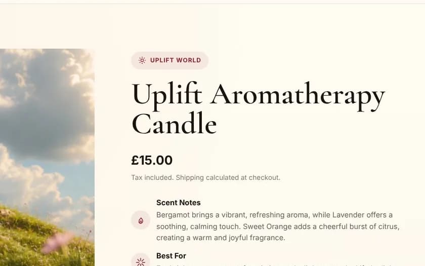
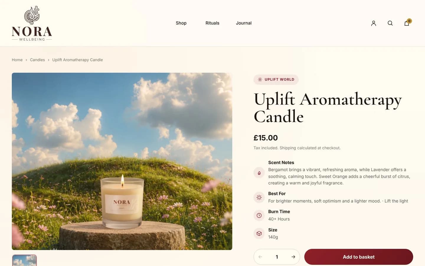
    On the product page the candle sits in its mood scene, tagged Uplift World.

    Why it worksIt keeps the story consistent from the homepage to the basket, so the customer never loses the feeling that drew them in.

    The Uplift candle product page, with the candle in its meadow scene and an Uplift World tag
  6. Answers in seconds

    Scent notes, Best for, burn time (40+ hours) and size (140g) each get an icon and a short line.

    Why it worksThese are the four questions that decide a candle purchase. Clear answers next to Add to Basket remove hesitation.

    The product details: scent notes, best for, burn time and size, each with an icon
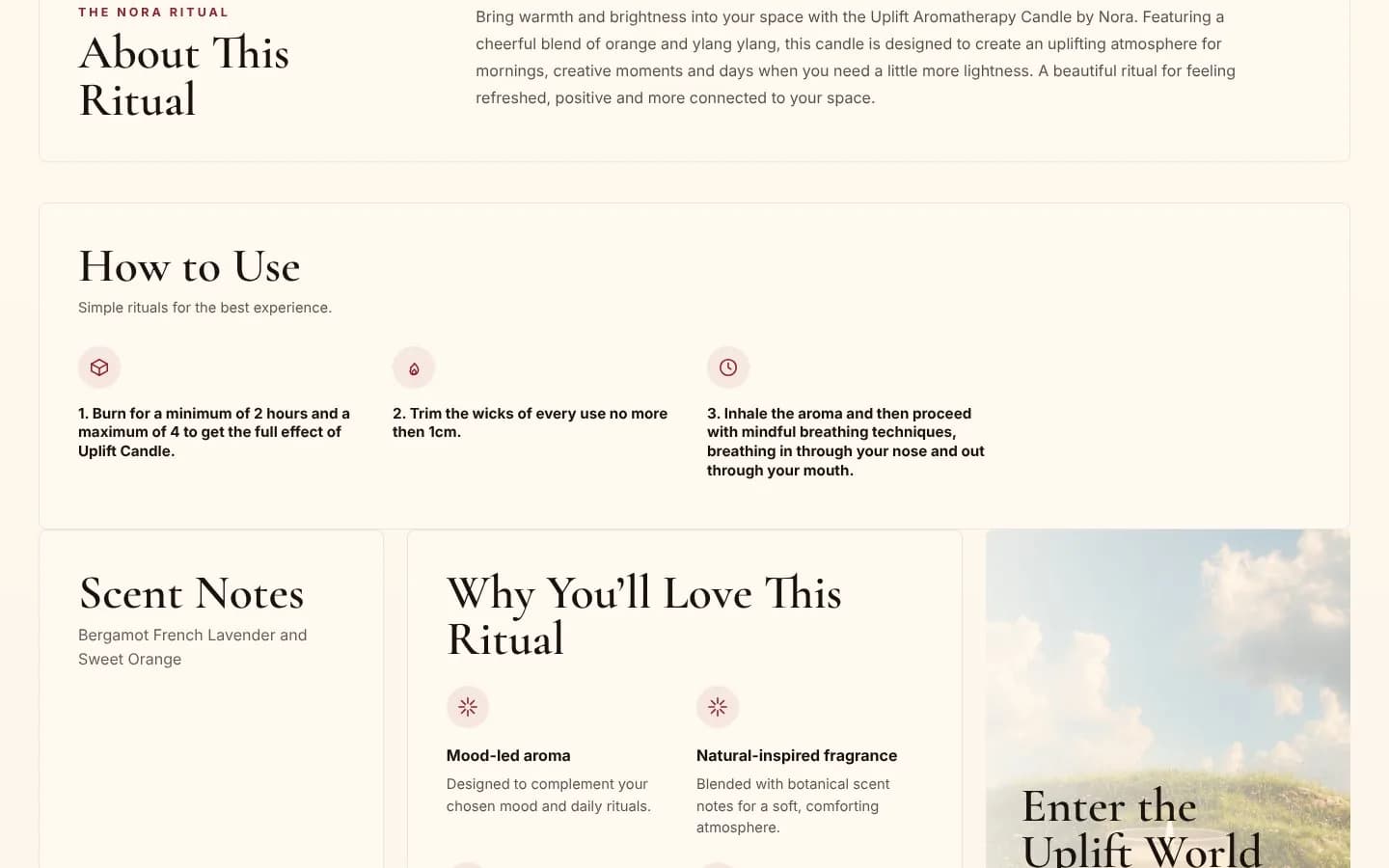
  7. Rituals, not just products

    Each product page explains how to use the candle as a ritual, in simple numbered steps.

    Why it worksIt adds value beyond the object, supports a premium price and positions Nora as wellbeing, not just home fragrance.

    The About This Ritual and How to Use sections on the product page
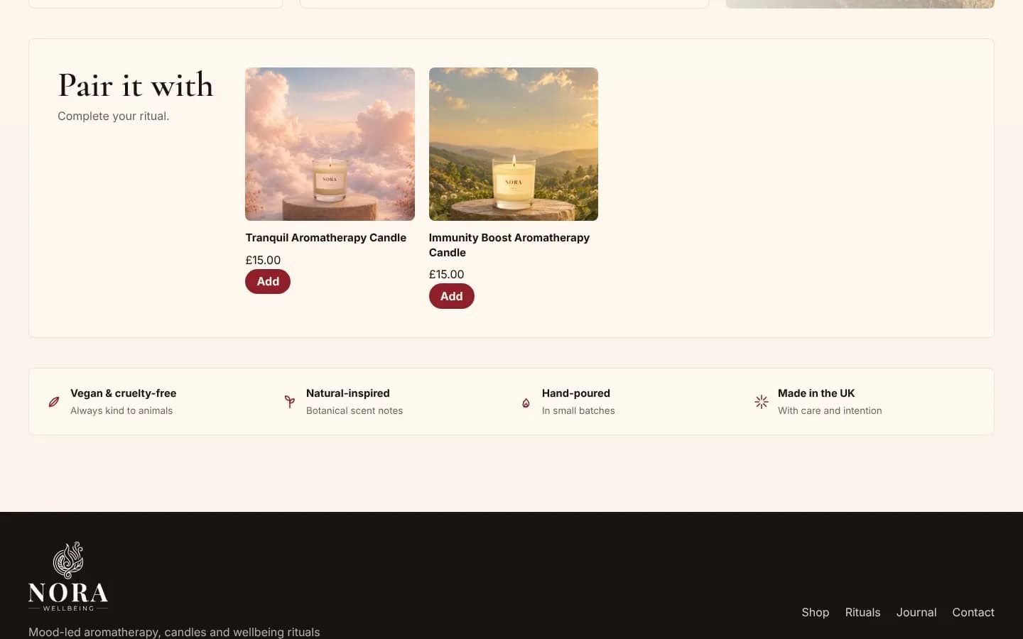
  8. Pairing that grows the basket

    “Pair it with: complete your ritual” suggests the other scents with a one-tap Add, above vegan, hand-poured and made-in-the-UK reassurances.

    Why it worksSuggesting a pairing as part of a routine raises order value without feeling like an upsell, and trust signals near the decision reduce doubt.

    The Pair it with section and a row of trust signals: vegan and cruelty-free, natural-inspired, hand-poured, made in the UK
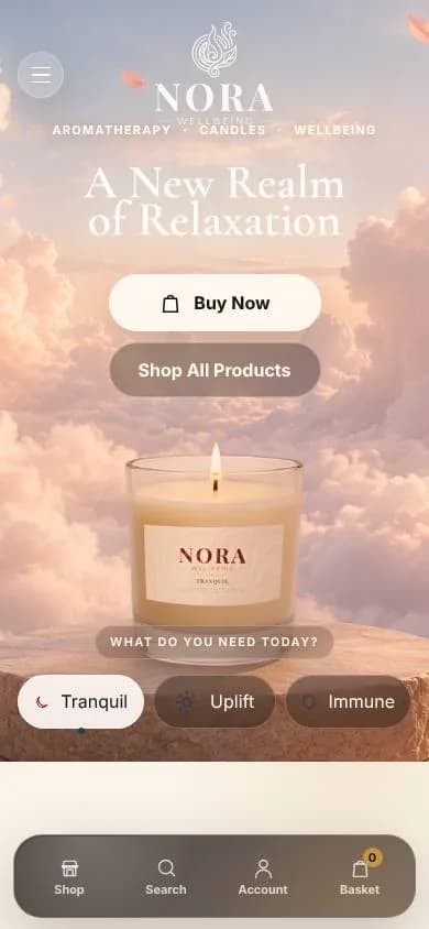
  9. Built for the thumb

    On mobile the navigation moves to a bottom bar (Shop, Search, Account, Basket) and the hero stacks into big, tappable buttons.

    Why it worksMost shoppers browse on their phones. Keeping the key actions within thumb reach makes buying easy one-handed.

    The Nora homepage on a phone, with stacked buttons and a bottom navigation bar
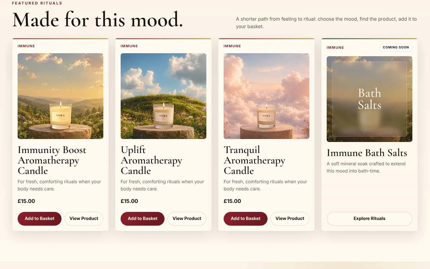
  10. Ready to grow

    Coming-soon cards for bath salts and a Nora Circle email sign-up are built in from day one.

    Why it worksThey create anticipation for the next launch and build an audience the brand owns.

    Product cards for the three candles and a coming-soon Immune Bath Salts card
I came with a logo I didn’t love and left with a brand I’m genuinely proud of. They understood exactly how Nora should feel, from the label on every candle to the moment someone lands on the website. It feels calm, premium and completely ours.
Danny, Founder, Nora Wellbeing

Your project could be next.

Reality has limits. We don't.

Tell us what you’re planning and we’ll show you how we’d approach it.